Master bathroom facelift
We moved into our forever home a little over a year ago. There’s a lot we love about it (amazing location, huge yard, perfect size), buuuut there’s also a lot we don’t like about it (its 1987 is showing - big time). So we’ve been tackling some smaller DIY projects to give our space a livable vibe while we save up the money to take on larger renovations.
Besides giving the entire main floor a desperately needed coat of paint, the first project I decided to tackle was giving our master bathroom a facelift because it’s the one we use 90% of the time.
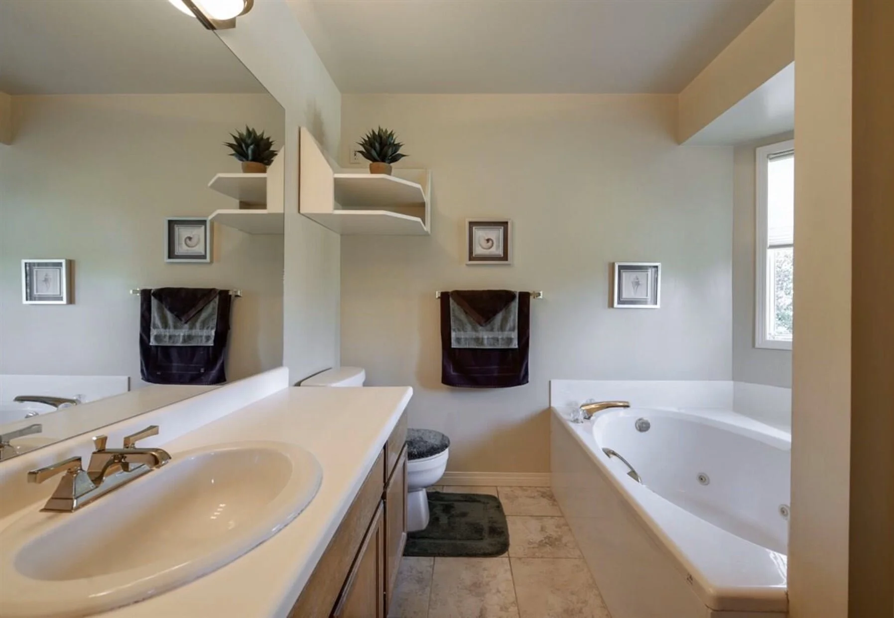
Here’s what it looked before:
(cue 80’s trigger warning)
Oak, beige and more oak (it’s a recurring theme throughout the house), plus a super bizarre shelf above the toilet, was not jiving with me.
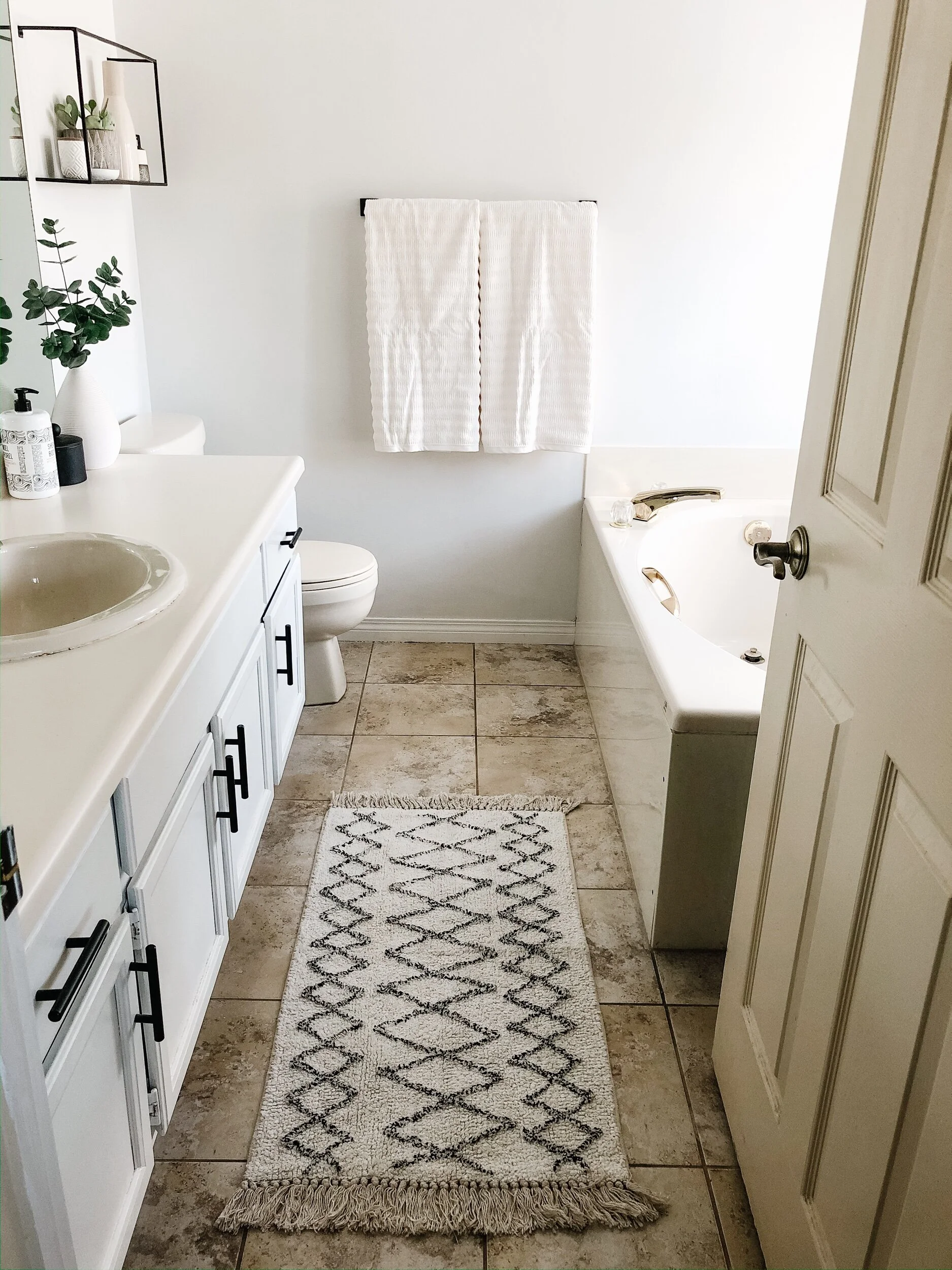
So over a few weekends I made some small, very effective updates and here’s what it looks like now:
MUCH BETTER! (breathes sigh of relief only white paint can elicit)
I made three key changes to give our master bathroom a fresh look:
1. Painting out the vanity
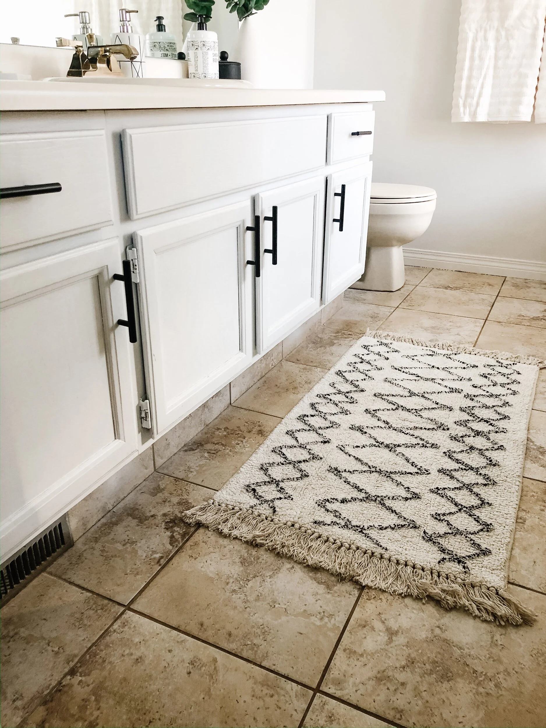
Trading orange oak for white paint and adding hardware (I’m extremely suspicious of cabinets without hardware…wtf is up with that?) was the first task.
I won’t lie, painting out the vanity was work. A couple things that made it “easier”:
Removing the doors and drawers made getting into every crevice possible
Using a chemical to strip the varnish helped reduce the amount of sanding
I picked up this matte black hardware at Canadian Tire and the new towels and bath mat from HomeSense.
2. Painting the walls
Next, I gave the walls a coat of crisp, white paint and removed the awkward shelf, which made a huge difference. The room feels 10x brighter.
I used the same colour on the walls and trim: Benjamin Moore’s Chantilly Lace (swoon).
3. Adding Scandi accessories
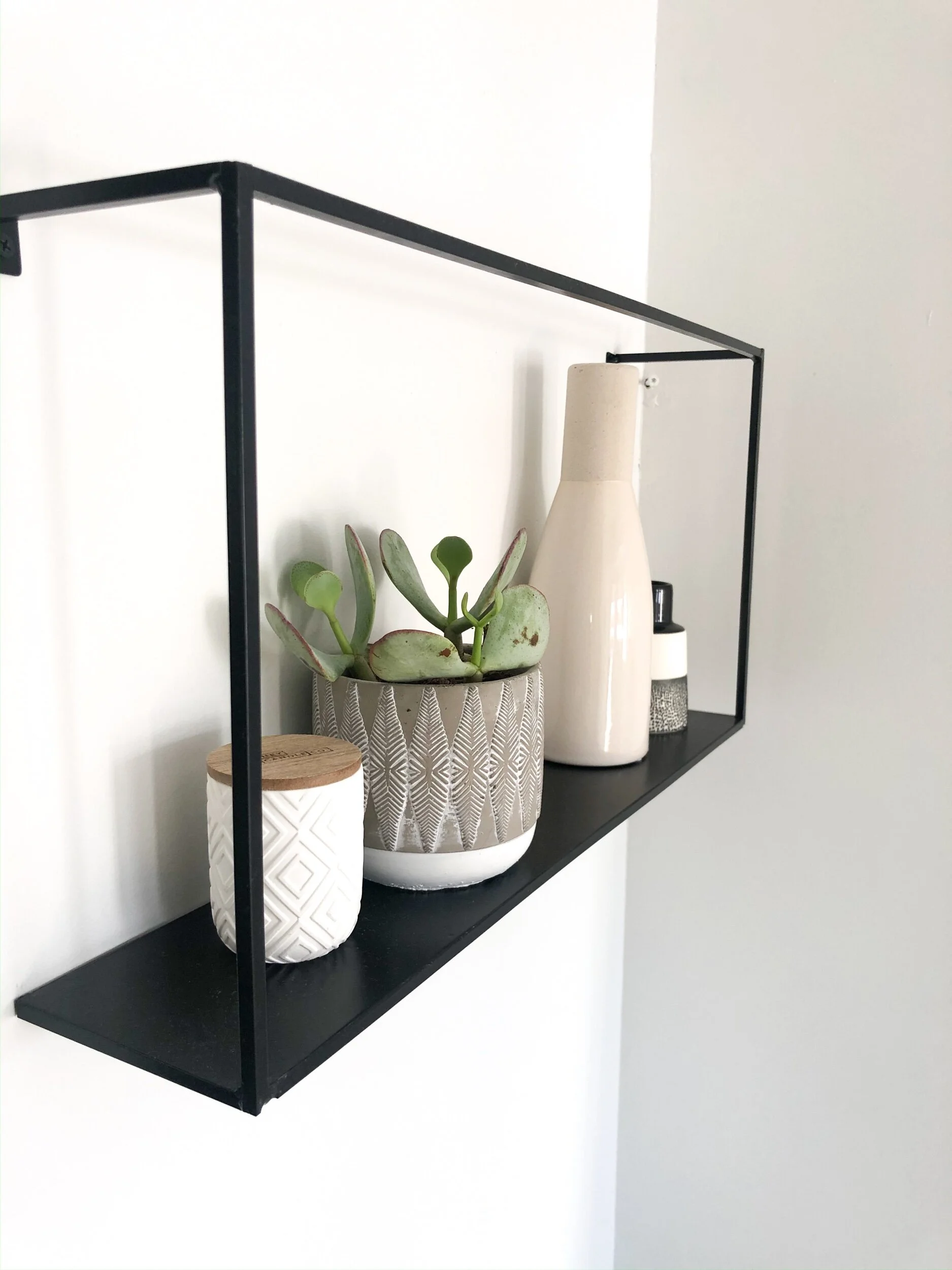
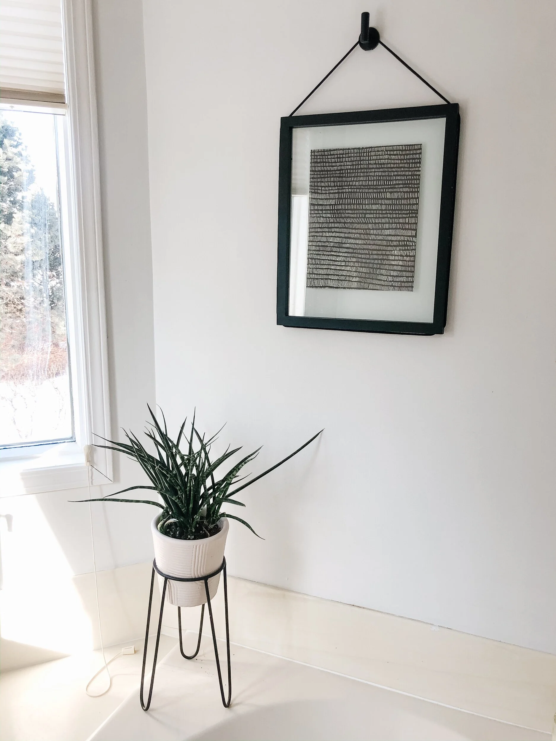
Lastly, I pulled together some black and white, Scandinavian-inspired decor to add the finishing touch.
A sleek shelf (JYSK: sold out but similar here), some vases (Structube and Simons) and a couple of plants (IKEA), and a sinple piece of artwork (Umbra) achieved the minimal vibe I was going for.
I’m really happy with the way it turned out, especially considering the cost was pretty minimal - definitely money well spent. It’s made the room a more pleasant space to get ready in (at least until we gut it and start over from scratch…).
I’m currently in the midst of a second project in our main floor power room where we’re doing a full renovation. Stay tuned for the final reveal (and/or a divorce announcement).
